A couple of weeks ago, I wrote about how you can use Twitter for news even if you don't have an account. It was my attempt at making it easier to delete your account if the only thing holding you back is breaking news.
I was wrong.
With Twitter getting ever more toxic, searching a subject for news has become useless. You'll get news, but it will be mixed in with an ugly mess of hate and misinformation. Unless you're someone who enjoys watching barroom brawls, it's not a pretty sight.
And it's not just my imagination that things are getting worse. Researchers at a digital civil rights group have found an increase in racial slurs. It's probably because the moderation system has fallen apart.
The thing about the misinformation is that is doesn't always come from trolls. Often it's just ordinary people repeating rumours they hope are true. They find evidence that their side is winning and want to share it with the world. Sometimes they will warn that it needs to be backed up, but you can still find yourself going down a rabbit hole that leads nowhere.
I haven't deleted my account, but I have deleted the app. And I have joined Mastodon.
As for the news, my advice as always is to find an RSS feed reader and subscribe to news sites you trust. Breaking news might take a day or two longer to get to you, but at least you'll know it comes from a reliable source.
One of the main reasons many people stick with Twitter is that it offers a stream of breaking news. If you can't wait to know about the latest developments in, for example, an election, Twitter news updates are as good as it gets.
But if that's the only reason you're maintaining a Twitter account, feel free to delete it. Go to twitter.com and log out. You'll be left with Explore and Settings. Explore has a News tab with links to trending news developments. Chances are, the news you want will be one of these. If it isn't, use the search bar. This works even for local news — just search the community you're interested in. Adding a hash tag can be helpful.
This is where I'm at right now. I haven't deleted my account, but I'm logged out. Whether I go ahead and delete the account is up to the new owner. I'm keeping a close eye on what Twitter turns into.
For several years, RSS has been my main source of news. And for several years, Reeder has been my RSS app of choice.
But then I heard about Unread 3 and decided to give it a try. It is slick! I feel disloyal for saying this, but I'm pretty sure I'll never go back to Reeder.
What's so great about Unread? Let me tell you.
Most impressive is the interface. I find myself using it even when I'm not that interested in the latest news. I just love the way everything looks and feels.
The app makes extensive use of swiping left or right. This means the feeds take up all of the viewing area on an iPad. Each article has a nice big heading, a picture and a full-paragraph summary — it's never truncated.
And if you tap to read the full story, you automatically go into reader mode — a presentation of the article without the ads or cruft commonly found on websites.
It really does make reading enjoyable.
There is one drawback, though — no Mac version. I almost always opt for my iPad to read the news, but there is the odd occasion when I want to read it on my Mac.
This means syncing with Reeder for Mac is a bit of a problem, but it can be overcome. I've been using Unread's own cloud service for syncing, but of course this only works with Unread. To get around this, a person could instead opt for one of several third-party services such as Feedly.
I've used Feedly in the past and don't recall any issues with it, so it's something to keep in mind.
One thing that took some getting used to with Unread was long presses. For example, if you want to remove an account or open it in a new window, you need to long press the name of the account.
In a way this is a good thing because it takes advantage an interface action unique to iOS. So I consider myself educated.
There's no real disadvantage to downloading Unread and trying it out. It's mostly free. A subscription gets you widget customization, article actions, caching, custom app icons and premium support.
Article actions include sharing articles via email. I'm not sure why, but I'm able to do this with a long press despite not being a subscriber.
If you do subscribe, it's $20 a year. Reeder, on the other hand, has up front pricing without a subscription ($10 for Mac, $5 for iOS). They ask you to pay again for a major upgrade. In the past, I've happily done this because it's an app I use a lot and I want to support the developer. I may wind up subscribing to Unread for the same reason.
The caretaker at an apartment building in Medicine Hat, Alberta, imparted wisdom to me one day that applies to many things in life.
I was kept awake at night by a neighbour playing loud music. Ironically, and weirdly, the song was Sounds of Silence by Simon and Garfunkel.
I complained to the caretaker and he took care of it — by kicking the guy out. This seemed harsh for a minor offence but he had an explanation.
If you let the bad ones stay, the good ones will leave, and eventually you'll be stuck with nothing but bad ones.
I've seen the truth of this in online forums over and over again. What thoughtful, intelligent person would want to express an opinion knowing that they will be shouted down by some anonymous schnook?
Very few would. This is why Twitter is often dominated by obnoxious loud mouths you would never allow in your home.
Twitter tries to keep things down to a dull roar by banning the worst offenders. If they don't, Twitter will turn into a cesspool of lies and hatred. No advertiser would want to be associated with it.
Now Elon Musk wants to take full ownership because he says he's concerned about free speech. It's bizarre that anyone would see Twitter as an important forum for free speech. It's more like a forum for snarky remarks and snide asides that contribute nothing to the kind of consensus needed for a healthy democracy.
But let's say he's on to something: Twitter needs a wider range of voices — no holds barred! What would that Twitter look like?
You want to spread misinformation? Come on in — it will all get sorted out in the big mix of free speech.
The wise caretaker in Medicine Hat would be appalled by this vision. Twitter would soon be nothing but toxic trolls arguing with each other while the rest of us move on. The only advertisers left would be scammers looking for suckers.
It's no wonder the Twitter board is mounting a defence against Musk's takeover bid. He would put them out of business.
If you want to move a window on your Mac, you position your mouse cursor so you can click and hold on the top part of the window. But it's not always that easy.
There's a lot of stuff up there. If you're using a web browser, it might be full of tabs. If you're using Word, it might be full on functions. Finding the right place to click might mean resorting to trial and error. What looks like a free spot might actually be yet another thing you can do with the app.
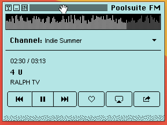
Back in the day, there were two big hints to let you know where you could grab. First, the cursor would transform from a pointer to a gloved hand with outstretched fingers. The fingers would close when you clicked. Second, the part of the window you could grab had five or six horizontal lines on it — a sort of grab pad.
There is still one app that has this feature, although it's not quite the same as what we had in the classic Mac interface. I'm referring to a collection of music with a retro look called Poolsuite. Not only does the cursor turn into a grab hand, but it can also turn into a hand with a pointing finger when you hover over buttons in the top left.
Maybe the thinking among app designers now is that people are so used to working with apps that they don't need these cues any more. But I see it as a sort of courtesy. Poolsuite's developers want us to feel comfortable when using their app. Making the grab space obvious is a nice touch. Much appreciated.
There are plenty of recommendations for text expansion apps for the Mac, but neglected in the reviews is quite possibly the most awesome of them all — espanso.
A text expander, for the uninitiated, is an app that allows you to create shortcuts that expand into longer words or phrases as you type them. If you're tired of having to type the same set of words over and over again, a text expander is a godsend.
There is a limited expander built into your Mac that can be set up in the keyboard system preference under the text tab. There are also several good apps you can buy — do a search on Mac text expanders and you'll find them.
You might have a little difficulty finding the unheralded espanso, so let me tell you more. One: it's free. Two: it has a ton of features that keeps growing. And three: it's available not only for Mac but also Windows and Linux.
I was at first turned off because you need to use Terminal to install it. I had been getting the dreaded command not found error in Terminal, which made the thought of installation even more off-putting.
Anyway, I finally got my command not found woes cleared up, thanks to OSXDaily. espanso is now installed and doing great things.
Let me be clear: it has a lot more going for it than being free. (The developer does ask for donations, so please make one if you can afford it.)
There is a ton of stuff you can do — the documentation is massive. My favourite so far is a clipboard trigger you can use to create HTML links. You copy the URL you want, type in the trigger (:a), and there it is — a link with the URL in it and the cursor sitting between the tags.
Plus, there are packages of text triggers you can install so you don't have to make your own. They range from emojis to HTML utilities. I installed one that creates a shruggie text emoticon because why not? So far I've resisted the temptation to install one that generates random dad jokes. You can pitch in by creating and uploading your own package using YAML.
And not to be overlooked is the espanso community, where you can get help from other espanso fans.
All this might seem like a lot of uber-geekery just to save some typing. But digging into the Terminal and doing a bit of coding is what makes computing fun.
After some digging, I discovered that iPad weather apps using Environment Canada data do indeed exist. They're just hard to find. The App Store search buries the good stuff under scammers and review-gamers. The one-star written reviews are your best warning — stay away from them.
You may have better luck using a search engine, although even these results are mostly more about making money from affiliate links or pushing you to download an ad-riddled app.
I found three of the apps in this list in the comment section of an article. Comments can also be cesspools of hawkers trying to sell their stuff, but there are still a few good people out there genuinely trying to be helpful.
In my mind, the best Canadian weather apps for iPad should have two things: accuracy and a nice layout. Accuracy means data from Environment Canada and a nice layout means, at the very least, no ads.
Here are the top five contenders:
1. Celsius: uses Environment Canada data
The first screen has a list of locations with the current weather plus the forecast high and low.
Tap and go to a second screen with details including hourly forecasts, seven-day forecasts, wind, humidity, dew point, visibility, pressure, sunrise and sunset. Radar is available but you have to find it on the Environment Canada website.
2. Météo: uses Environment Canada data
The list of locations and details are on the same page, making the layout more cramped than Celsius. It works better horizontally.
There are more details, though: hourly forecast, seven-day forecast, wind, AQHI, pressure, visibility, humidity, dew point, normal temperatures, yesterday's temperature, yesterday's precipitation, sunrise and sunset. Alerts, radar, satellite and lightning and available within the app.
3. WeatherCAN: uses Environment Canada data
This is the official Environment Canada app. It is an iPhone app that also works on iPad.
Locations are in a tap-down menu with details on the same page. Details include past 24-hour conditions, current conditions, sunrise, sunset, COVID-19 trends, hourly forecast, seven-day forecast, radar and weather-related messages such as news about World Environment Day, World Oceans Day or solar eclipses.
4. Atmosphérique: uses Environment Canada data
Locations are in a tap-down menu, with details on the same page in a layout that seems cluttered compared with the other apps. It only works vertically, and there is a banner ad at the bottom.
You can also find Atmosphérique Pro, which is end of life and refers you to Atmosphérique 4. I wasn't able to find it.
Details include seven-day forecast, hourly forecast, past 24 hours, radar, normal temperatures, sunrise, sunset, humidity, pressure, humidex, wind, visibility, dew point, yesterday's temperature and yesterday's precipitation, records and averages.
5. Weather Network: unknown source of data, but appears to be based in Canada
Locations are in a tap-down menu with details on the same page including two ads, one in the middle and one at the bottom.
Details include hourly forecast, 36-hour forecast, 14-day forecast, wind, humidity, pressure, visibility, ceiling, sunrise, sunset, yesterday's temperature, air quality and UV report (appear to be the same thing), pollen and radar.
Never mind the outrageous click-bait headlines that don't match the story. Never mind the press releases that are copied and pasted verbatim.
The so-called journalism that's really been grinding my gears lately is the tweet roundup.
Here's how the formula works. First, do a lame summary of some major event that's trending. Second, search Twitter for reactions. Third, embed a dozen of the most inflammatory tweets into your story. If you want to seem balanced, try to find a few that take an opposite stance.
You might think this is lazy journalism, but it's just the opposite. This is the story you write when you're required to churn out stories by the dozen throughout the day.
It's making the most of the news of the moment. Sure, these stories are terrible, but quality is not the point. The point is to keep readers engaged for a few more minutes until the next thing trends. Advertisers demand it.
When I come across a story like this, I refuse to read it. I have no idea who these people being quoted are since none of them use their real names. And even if they did, who cares what a bunch of random strangers wrote as a knee-jerk reaction? Am I supposed to admire how clever and witty they are?
And it's getting worse. In the past you could be sure that what was being quoted was indeed from Twitter because it was embedded from Twitter. Lately I've been seeing stories where they don't even bother doing that. All you get is a quote that the writer purports to be a tweet.
Maybe it was from Twitter. Maybe it wasn't. With standards this low, they could write anything and say it was from Twitter. How could anyone possibly check?
More and more, I'm thinking the solution is for every reputable news service — big and small — to put its content behind a paywall. If you want solid, reliable news, you should have to pay for it.
It's the first redesign since newsonaut started in 2010. What took me so long?
I think I clung to the old design for so long because I thought it had a classic look that stood the test of time. But I was wrong. It was looking dated.
And there are a couple of other factors. First, the pandemic is at long last coming to an end. Second, I'm pretty close to retirement. Both of these things are cause for optimism and even celebration.
So newsonaut now has a brighter, bolder, outer-spacier new look.
Will anything else change? I'm thinking of focusing more on writing about the news and journalism, but that could change at any moment.
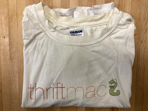
thriftmac is a project that has been been kicking around since 2006 — almost an eternity on the internet. It's older than that if you count it's predecessor. There was a thing called Free for X for a couple of years.
It's a place where you can find 100-per-cent free Mac apps. It's not like the Mac App Store, where "free" might mean free trial or useless unless you pay for a subscription.
You can download these apps and use all the features for as long as you want. Yes, apps like this really do exist.
In its heyday, thrifmac was chock full of Google ads, bringing in $100 US on good months. It peaked at $200.
The site wasn't just a collection of links to apps. I blogged like crazy. Nothing was too trivial to write about if it involved a free Mac app.
I actually ran contests. thriftmac has a worm for a mascot (because apples sometimes have worms in them) so I ran a contest to name the worm. The winning name was Scrimpy, and the winner got a free thriftmac T-shirt.
Another contest was based on the Survivor TV show. I listed 10 apps I thought were only borderline deserving of being on thriftmac, and people voted in weekly rounds to eliminate one of them. The loser was OneButton FTP.
I wrote literally hundreds of articles until I finally ran out of steam. Since that time, thrifmac has existed for the several years as an app repository only — no blogging. (Although that might change soon.)
The thing is, the site is basically a database with a lot of useful information in it. thriftmac presents that database through a content management system called Textpattern.
That means it remains, after all these years, something to play with. What are the various ways I can present this database?
And so we have arrived at version five in 2021.
The biggest change for visitors — aside from the spiffy new look — is the switch from sections to categories. Before, you would have to click on one of eight sections, then look through the categories within the section.
Now, you can just go straight to whatever category you want.
Behind the scenes, I set several challenges for myself — challenges only a coder might appreciate.
No divs. Much of the web code I see is littered with divs. I've seen tutorials where they have a div for the sidebar with a class of "sidebar" and a div for the main content with a class of "main." It's bizarre. Why not use the perfectly good tags we have available to us — aside and main.
No classes. If you use semantic tags throughout, you can dispense with many classes. I managed to whittle them down to just one.
No JavaScript. I've got nothing against JavaScript — in fact, I've used it to make a lot of fun staff. But I wanted to resist the temptation this time.
Use grid and flex. I wanted to be done with bolting on third-party layout solutions like Bootstrap or Foundation. thriftmac now uses grid for layout, with a touch of flex.
Creative use of CSS. There's a few touches so far, and I hope to sneak in a few more.
No CDNs. I wanted to dispense with third-party dependencies, but I couldn't resist one Google font (Raleway, which was also used in the previous version of thriftmac) and Font Awesome. I thought about just using the generic sans-serif and letting people use whatever system font they have on their computer, but it seemed too lacklustre. I'm also a sucker for icons, and the site has precious few graphics otherwise. But that doesn't mean I'm using CDNs. I downloaded both, and they're being served up from the site.
I enjoyed the exercise, and I think the site looks pretty good. When it's a hobby site, it's really only your own opinion that counts anyway. And there's sure to be more tweaks coming.